A yearly highlight for users is the , a totally-Instagrammable reflection on the songs, artists, and genres that defined their past 12 months.
The annual Wrapped is undoubtedly exciting, but many music lovers are bored of waiting until the end of the year for a neat graphic of their most-listened to tunes.
Cue: Spotify pie chart.
Here is everything you need to know about the tool, including how to make your own nifty chart.
What is a Spotify pie chart?
While the app’s official Wrapped feature only comes around once a year, this independent version developed by Californian student Darren Huang updates monthly.

Mr Huang – who calls himself ‘pie boy’ on his website – thanked users on after he ‘woke up to 514,000 [visitors] in two days’.
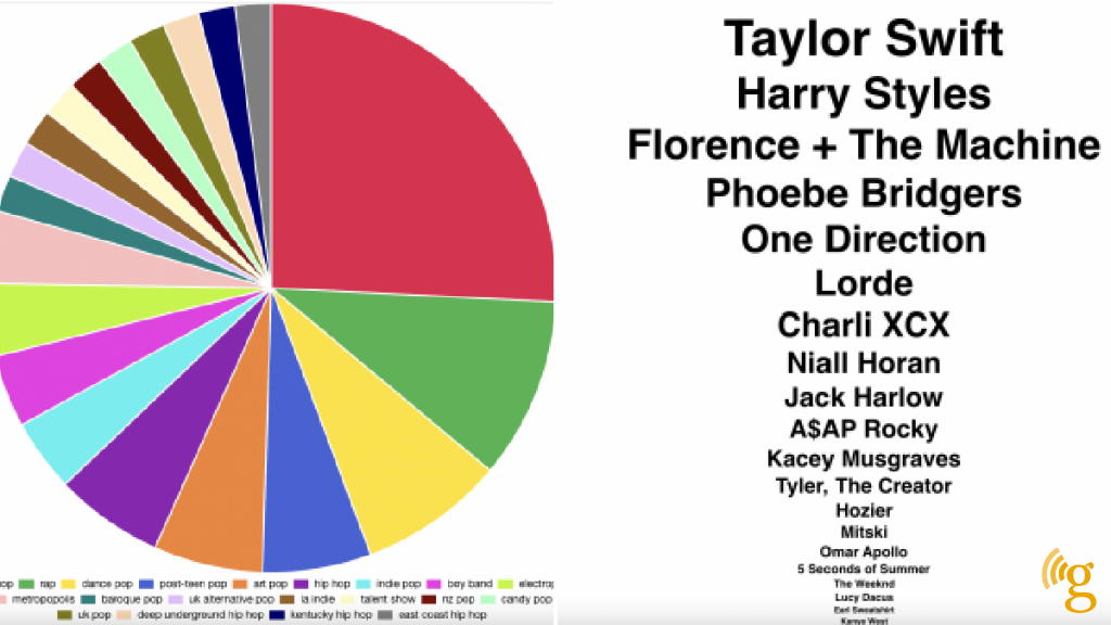
Users can see the specific genres of music they listen to most on the app, as well as their top artists.
Genres can range from Nu Gaze to Japanese Classical, and the chart helpfully separates them out into chunk varying in size, depending on how much you listen to it.
How do I create a Spotify pie chart?
Accessing your personalised pie chart is easy as, well, pie.
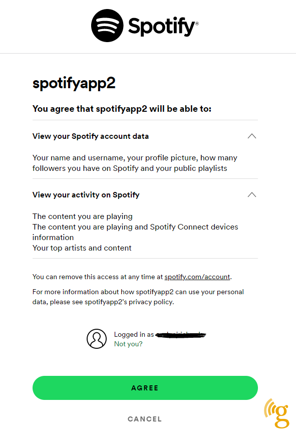
When you first land on the homepage of the , it will ask you to connect your account to ‘bake your monthly genre pie’.
However, with every third-party site, use at your own risk.
Once you’ve logged in, the pie will almost instantly appear and you can view just how tasteful (or not) your music choices are.


The chart will be split up into a rainbow of colours with a key underneath to help users identify what each section means.
You can also hover your cursor over a section of the pie (or tap the screen if you’re using a phone) to reveal the genre and which artists fit into it.
Underneath, you can see a list of the artists you’ve listened to most this month, which descend in size according to how much time you’ve spent listening to them.
Follow Metro across our social channels, on Facebook, and
Share your views in the comments below


